Chrysler Capital MyAccount App
Creating a better account experience for auto finance customers
Manager (as Director of Mobile Strategy)
Senior Product Designer
UI Engineer (Xcode/Swift)
Managing a team of UX designers and UI engineers
Directing the design and interaction strategy
Product design
Developing and architecting UI code (Swift)
During my time as the Director of Mobile Strategy at Santander Consumer USA (SC), an auto finance company, I managed a small team of designers and UI developers within the marketing department. We functioned as a kind of creative digital agency within the company with our own agile practices, separate from IT — setting the standards of all digital experience of our customers.
I had been advocating for a customer servicing app for more than a year, pointing to analytics and research that showed that more than 50% of our customers were making their loan payments on their mobile devices (via the MyAccount website). Research also clearly showed our customers wanted a native mobile app experience.
It's all about the customer
I presented our UX research to key stakeholders and showed them what we had discovered during our Design Thinking workshops. I provided a prototype and I made a case that if we could give our customers a native mobile app, it would increase customer satisfaction and bring new opportunities not available on desktop. We could increase payments, reduce servicing costs, and open up a new marketing channel to provide offers for qualified accounts via push notifications and in-app promotions.
Wireframes of MyAccount prototype app
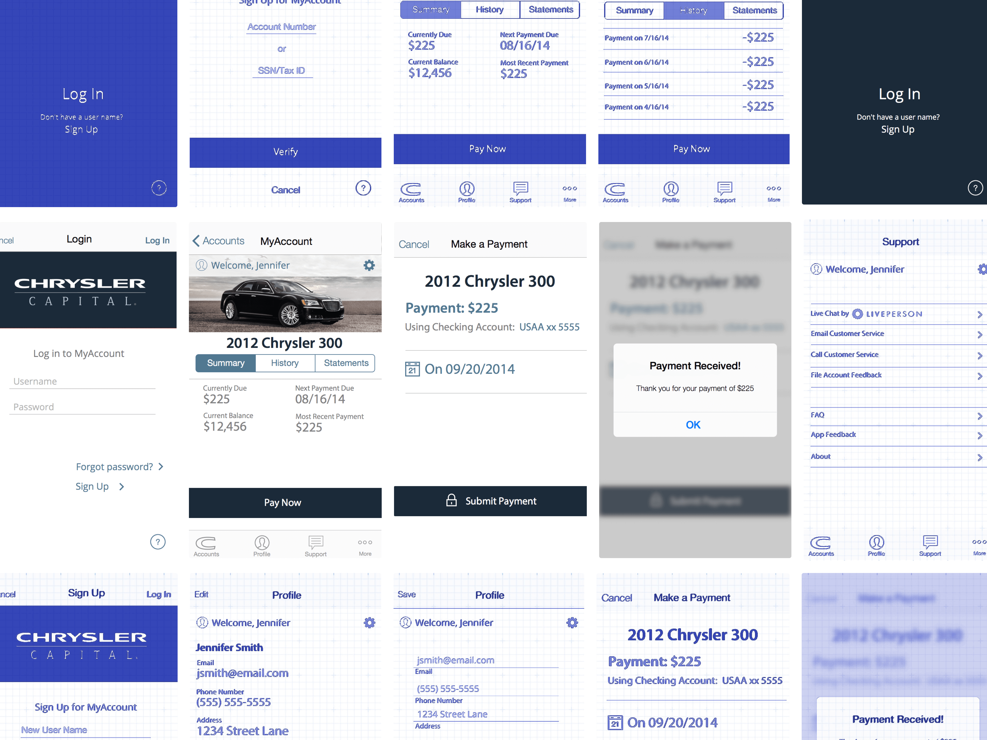
UI research
It took some effort and influence from myself and my leaders, but the right people were convinced and it was made an official project. We decided to make an MVP for iOS only and start with our Chrysler Capital brand (but adding the ability to easily switch out branding).
From the MyAccount Mobile Charter
"The MVP will be an iOS software mobile application that will provide customers a faster and easier way to make payments to their accounts through MyAccount. The solution will enhance the Chrysler Capital and Santander Consumer USA mobile presence, increase engagement, reduce Customer Service call volume, and provide a product with a competitive advantage."
Departments InvolvedAccounting, Accounts Payable, ASU, Collections, Customer Service, Data Services, InfoSec, Legal/Compliance, Marketing/UX, OOP
- Support only iOS Devices and the Chrysler Capital brand
- Allow customers to update demographics
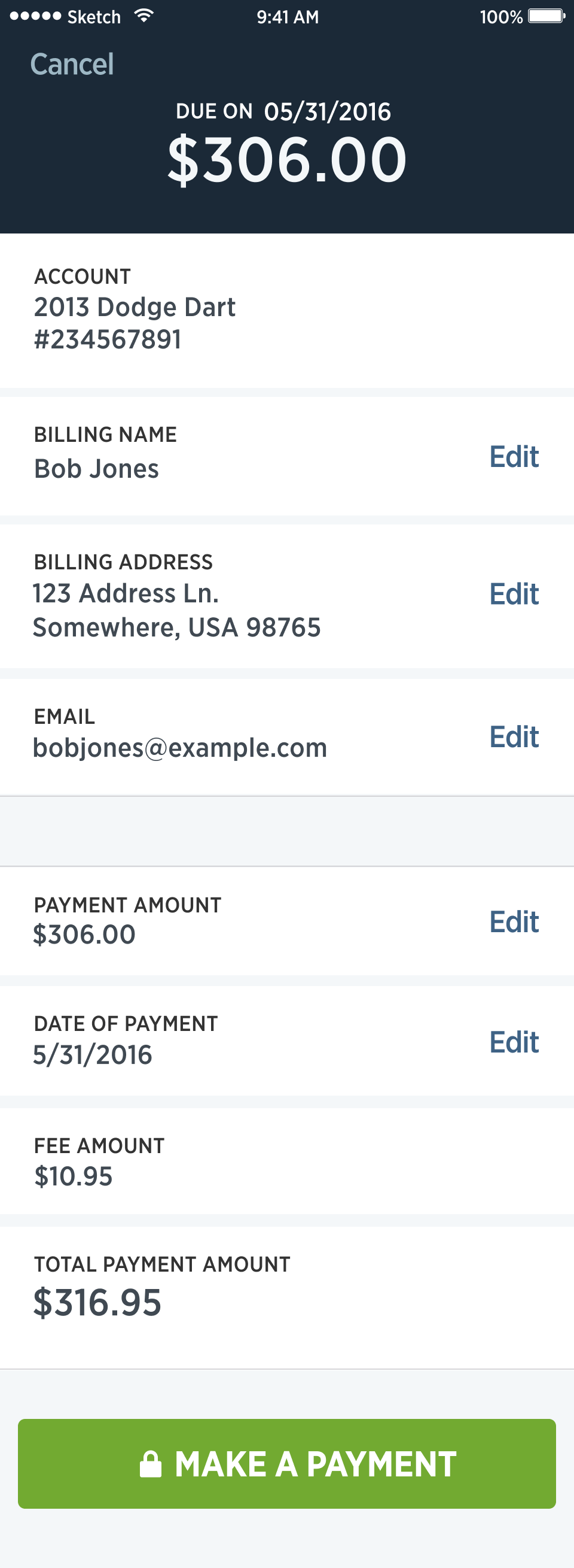
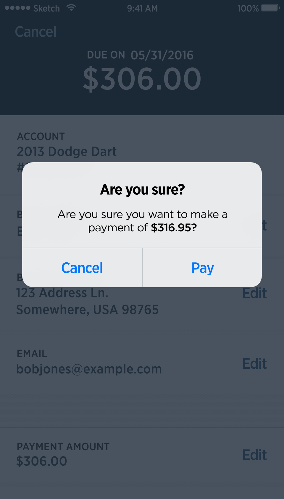
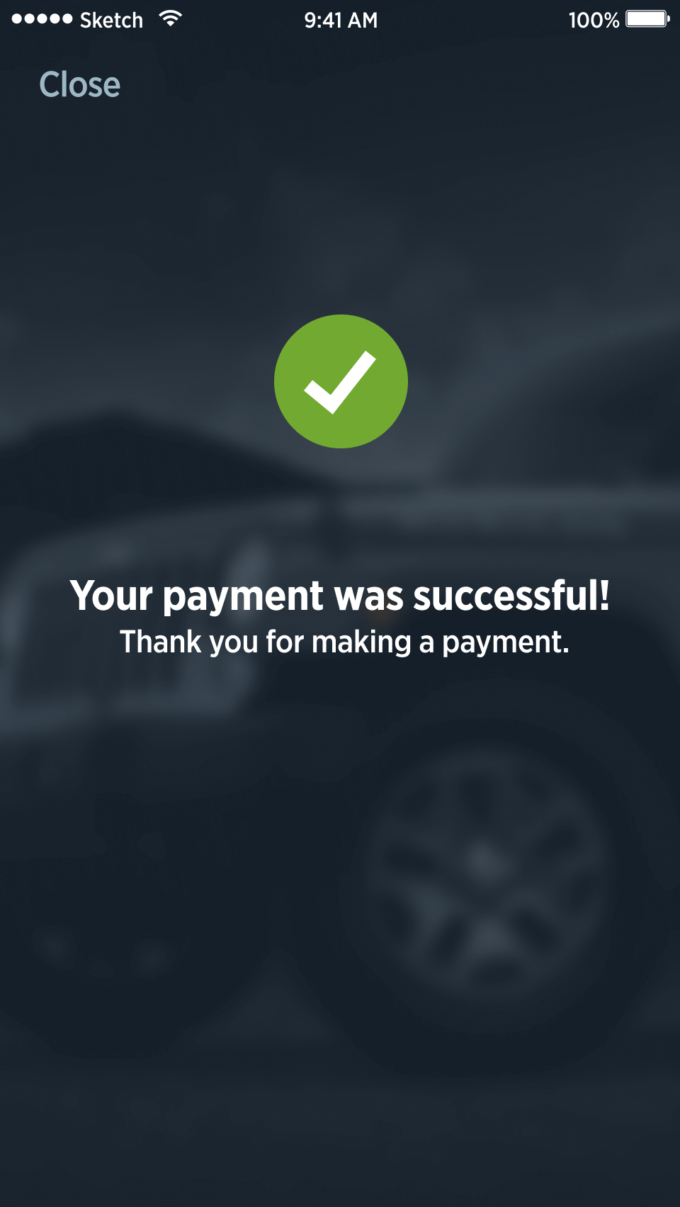
- Provide customer ability to make payments
- Provide ability to view account and vehicle details
- Provide ability to receive critical alerts through in-app messages and push notifications
Creating a native mobile app is hard
Honestly, it was a very risky project with a lot of unknowns and limited resources. We had convinced everyone that it was a worthwhile endeavor and now we were under pressure to deliver. The biggest goal for myself and my team was to ensure that the design and experience was delightful — the app needed to be great, not just good enough — even for an MVP.
How were we going to do this exactly?
Obstacles
The project officially started in Q2 and the goal was to complete a beta version of the MVP by the end of Q4. UX research and wireframes were complete, but hi-fi designs for the app had not been started.
My team was small. I managed my team and the mobile strategy, but I also had the most design and development experience. So, to meet the timeline, I needed to function as a senior product designer and a lead UI engineer. Along with me was another designer/UI engineer from my team.
The IT agile process was not structured for product teams at the time, so a special process would have to be established to create a versital pod of designers, UI engineers, and IT developers if we were going to be able to meet timeline.
IT developers and my team had not developed in Swift before, so we would need training. Also, my team had not designed an authenticated consumer app before. There were a lot of unknowns we would have to figure out while also delivering.
There were 10+ departments involved with the project and there were a lot of opinions on execution and what was important.
The way forward
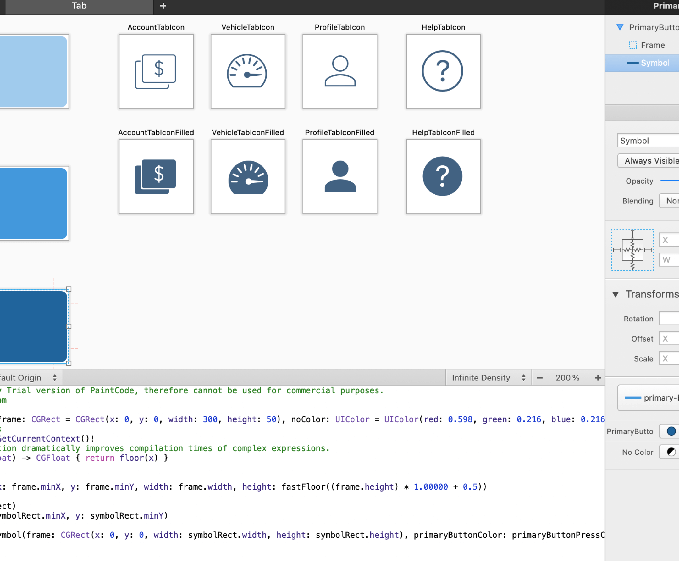
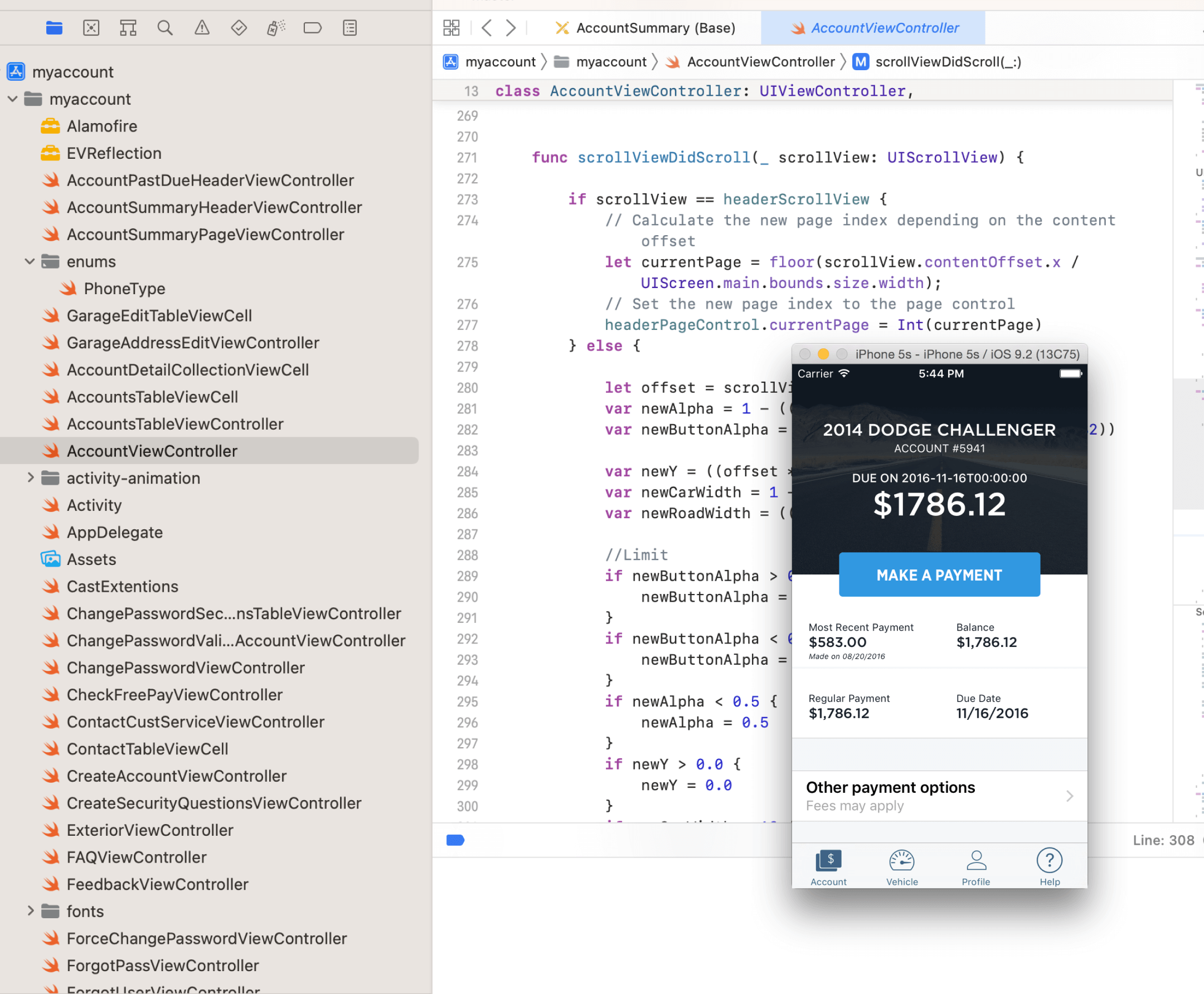
We didn't have a design system yet, so I first focused on building a simple design system with styles, components, and interactions in Sketch and Xcode. This made it easier for all of us to build the UI. Plus, it provided a way to easily switch branding (since we had more than one brand).
To fastrack the UI building, I created my designs in Sketch and Xcode together. This solved the problem of our knowledge gap in designing for an authenticated consumer app — ensuring the design would work in reality.
The final team was a scrum master, two designers/UI engineers (myself and another from my team), three IT developers (an architect, application engineer, a database engineer), and a QA tester.
We all were sent to a 7 day Swift development bootcamp where we learned enough to build a quality app.
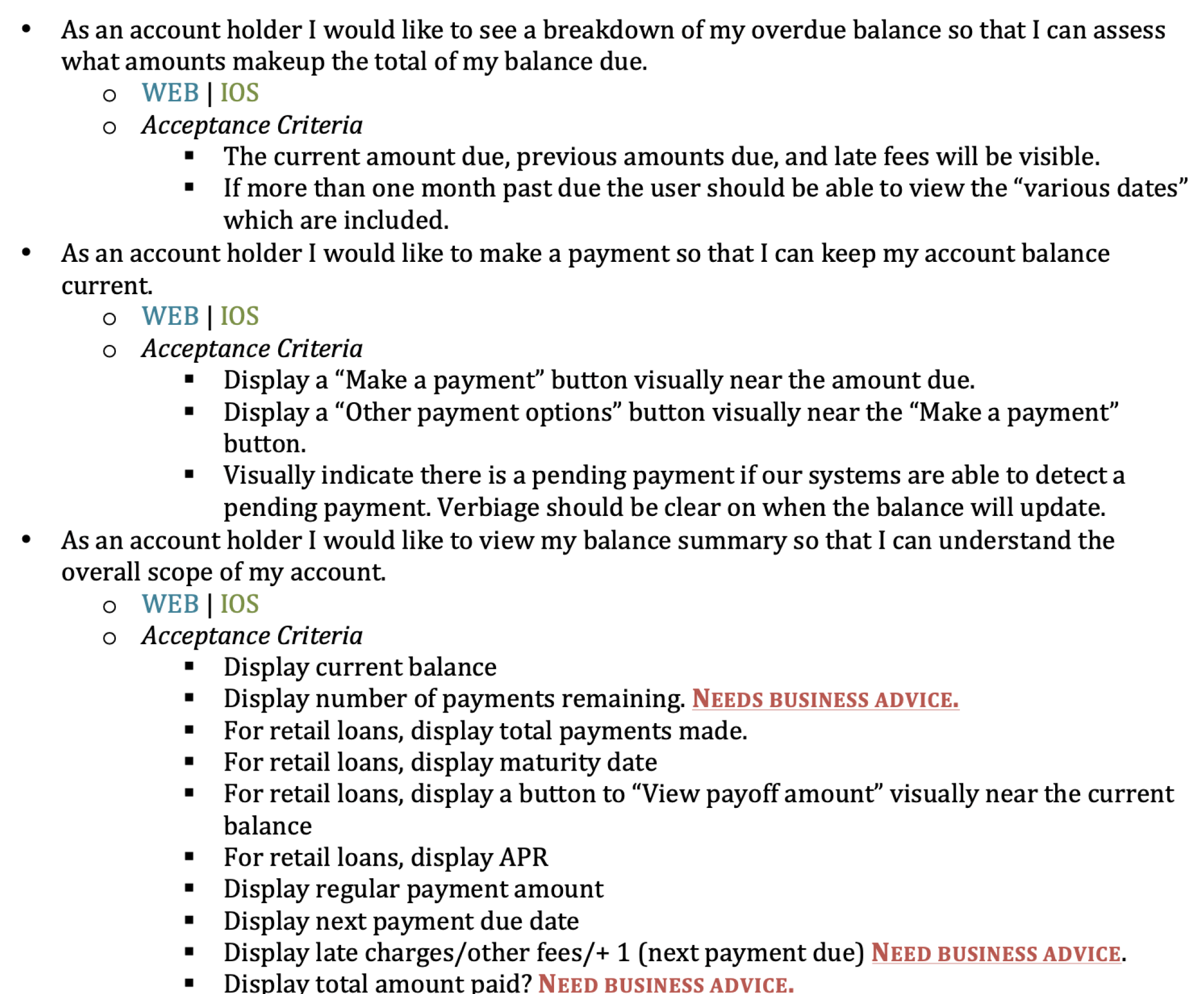
All of our user stories were written as clearly and presicely as possible, with all stakeholders signing off on the detailed acceptance criteria. This also helped the QA tester validate the expected functionality.
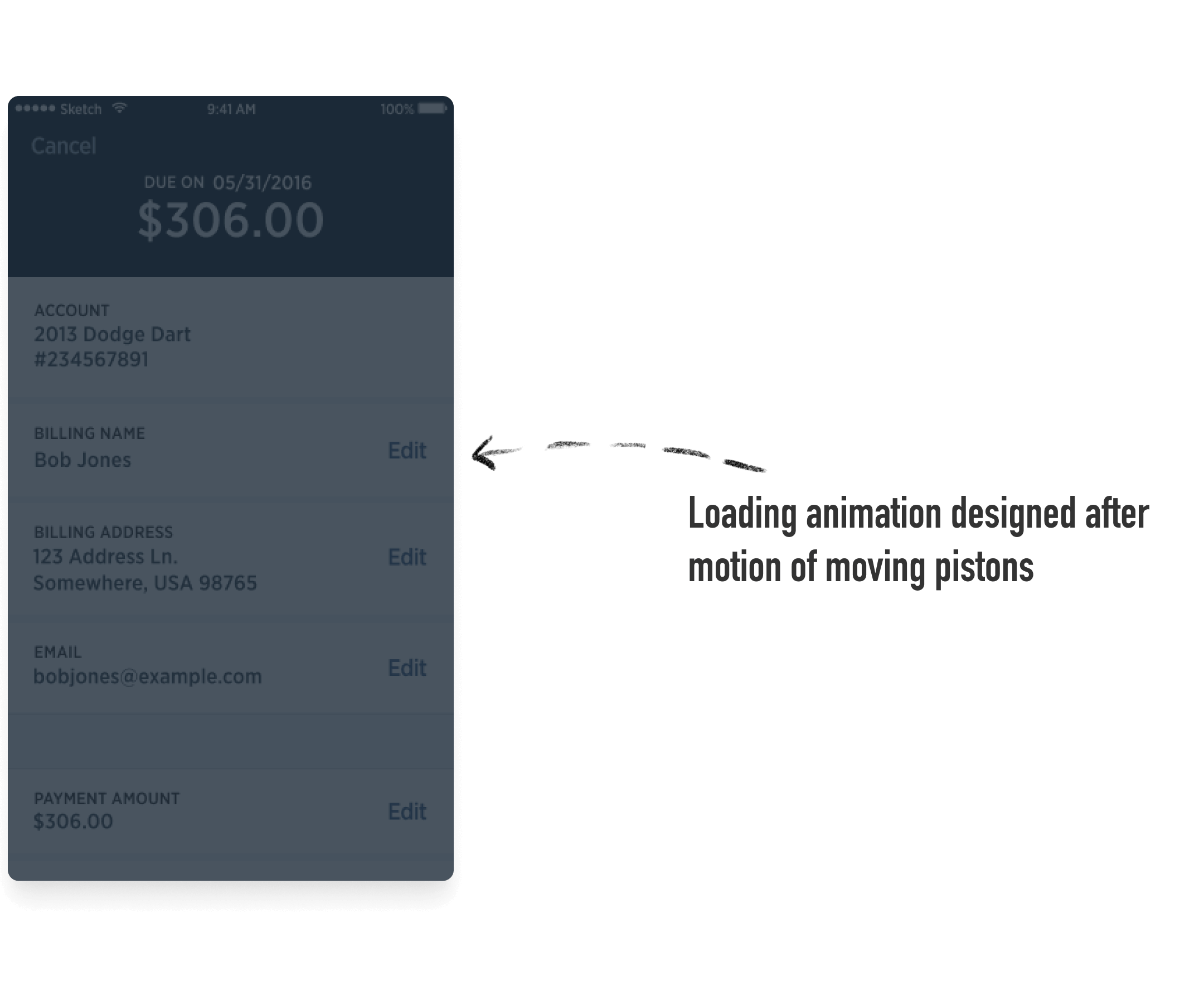
Delight in the details
We began our work of crafting the design — fighting against the ticking time - sprint by sprint.
"To sleep well at night, the aesthetic, the quality, has to be carried all the way through." — Steve Jobs
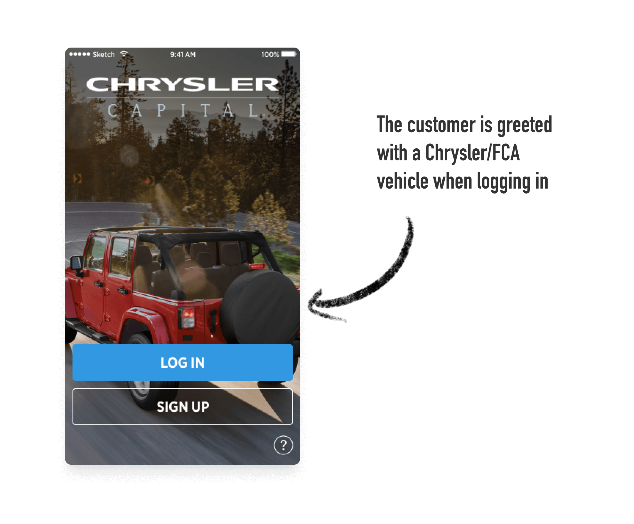
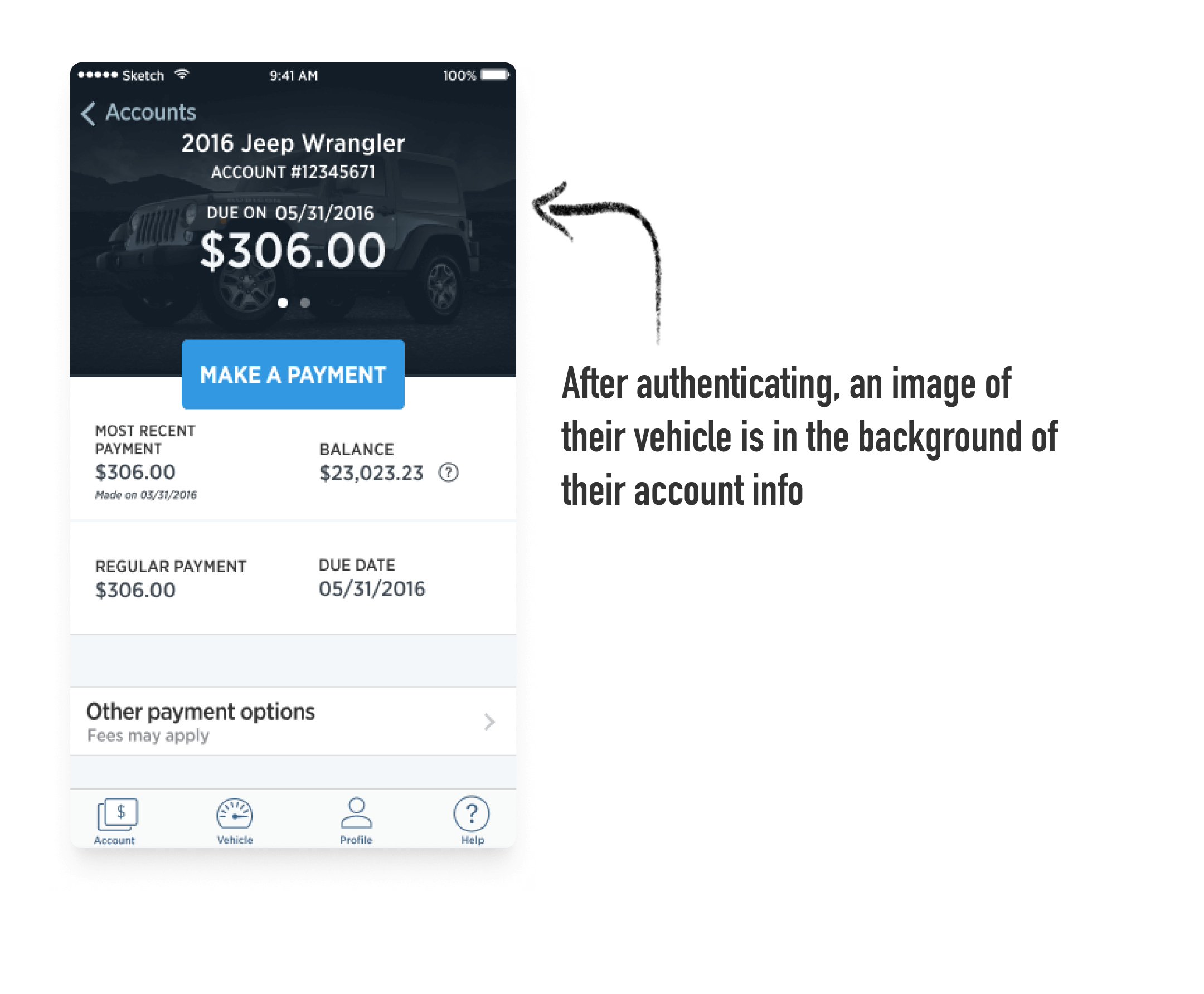
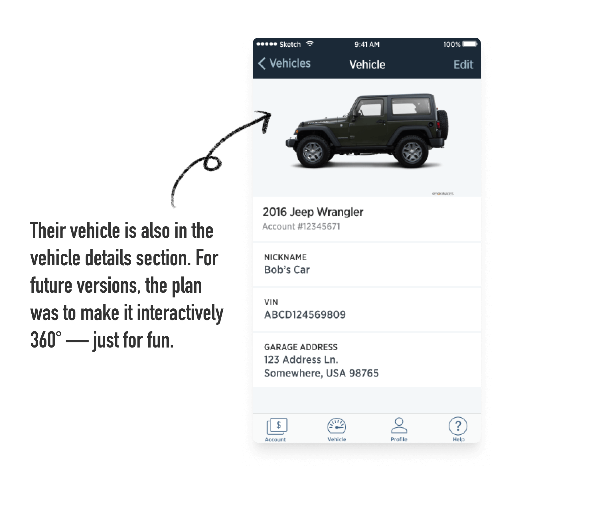
Connecting the customer to their vehicle and the brand
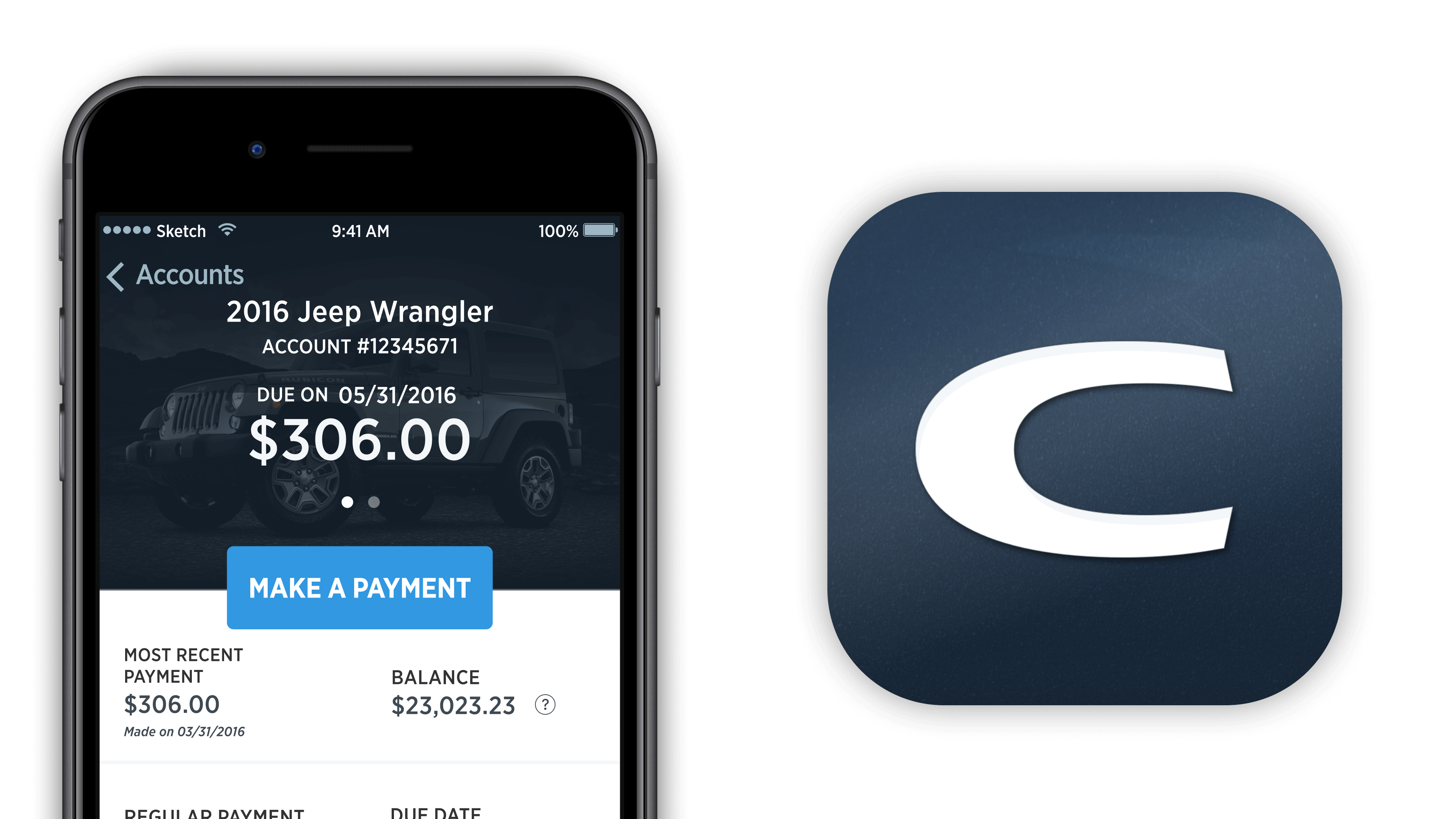
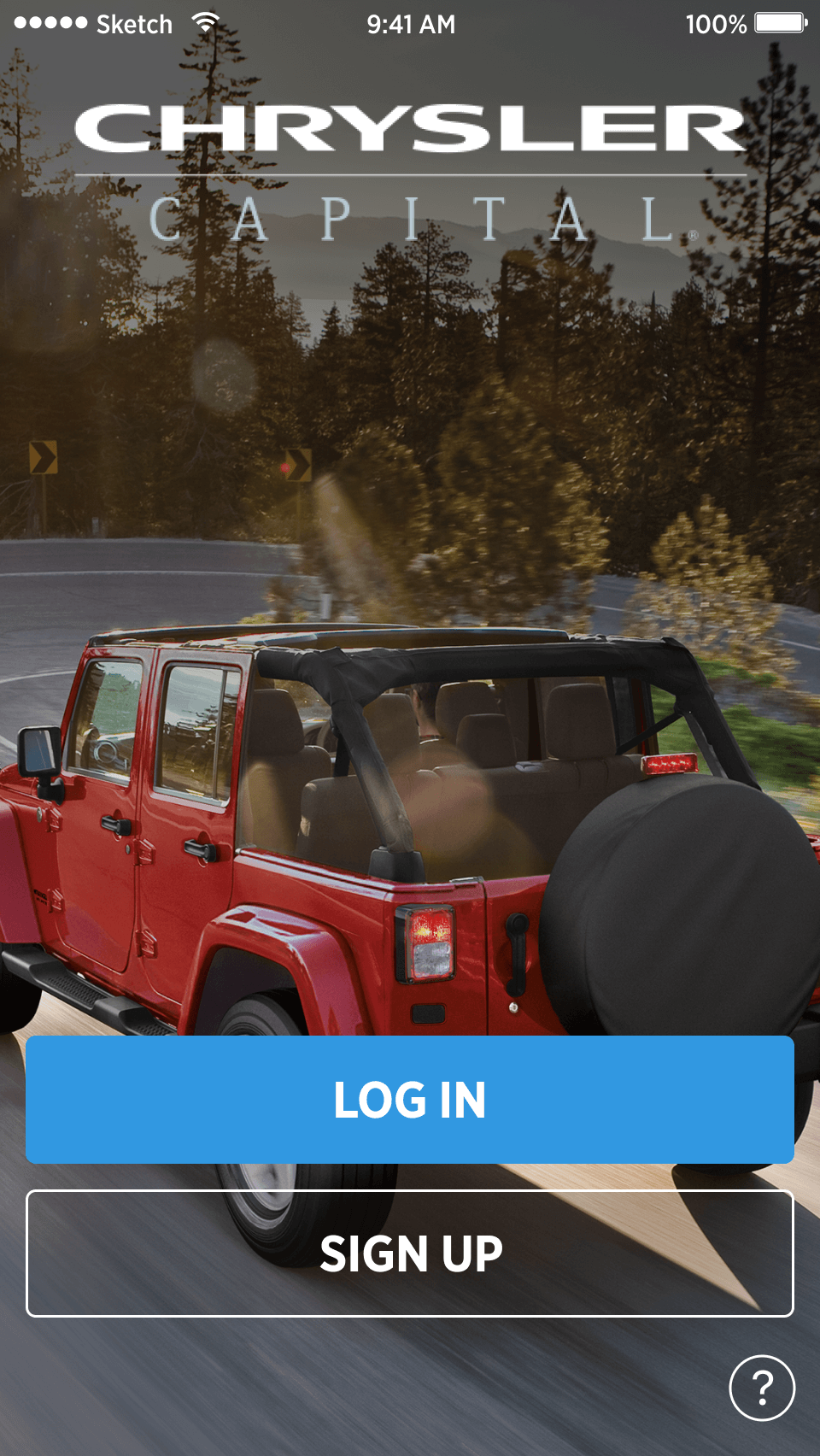
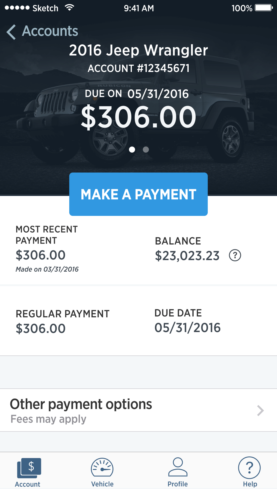
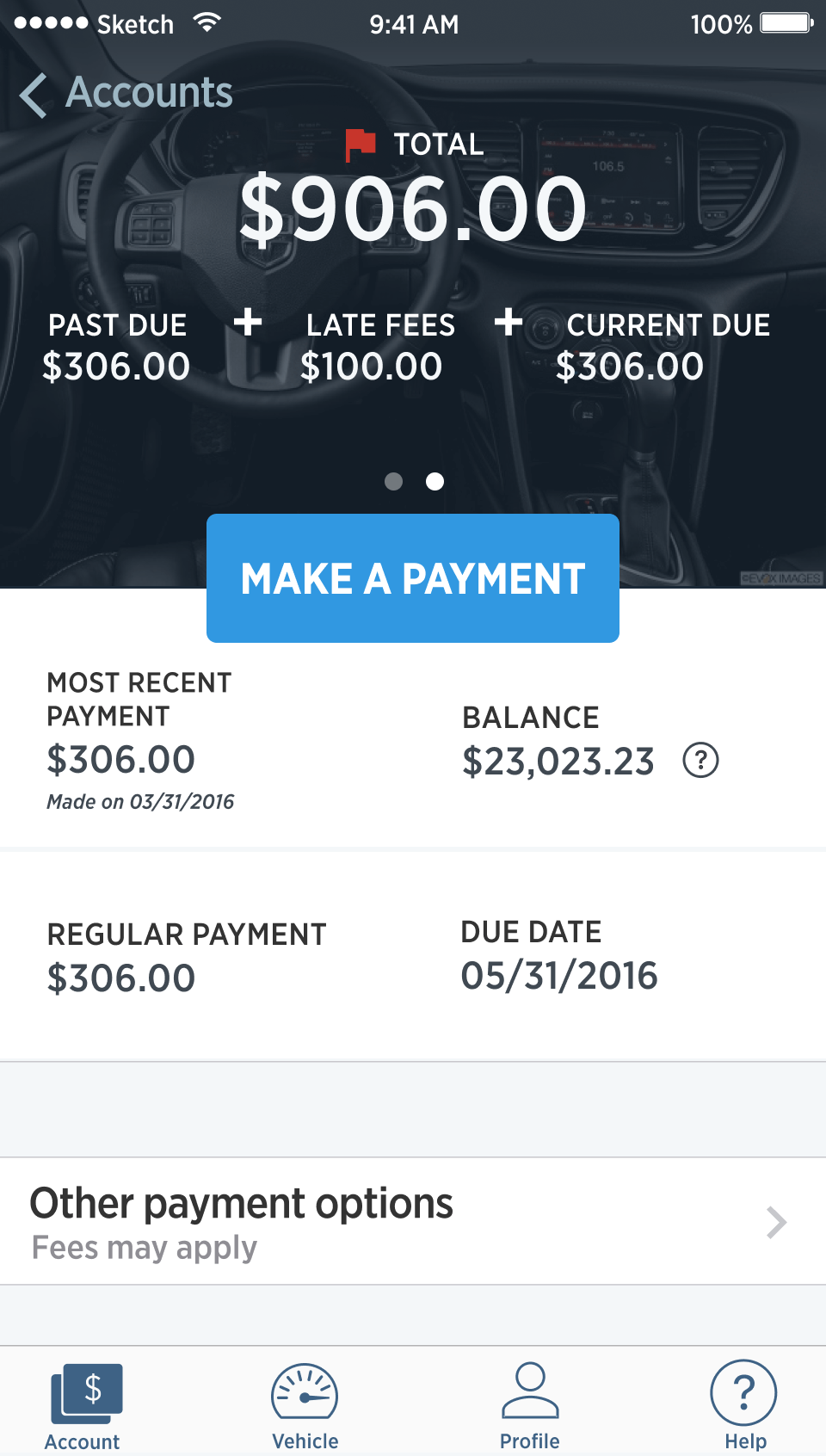
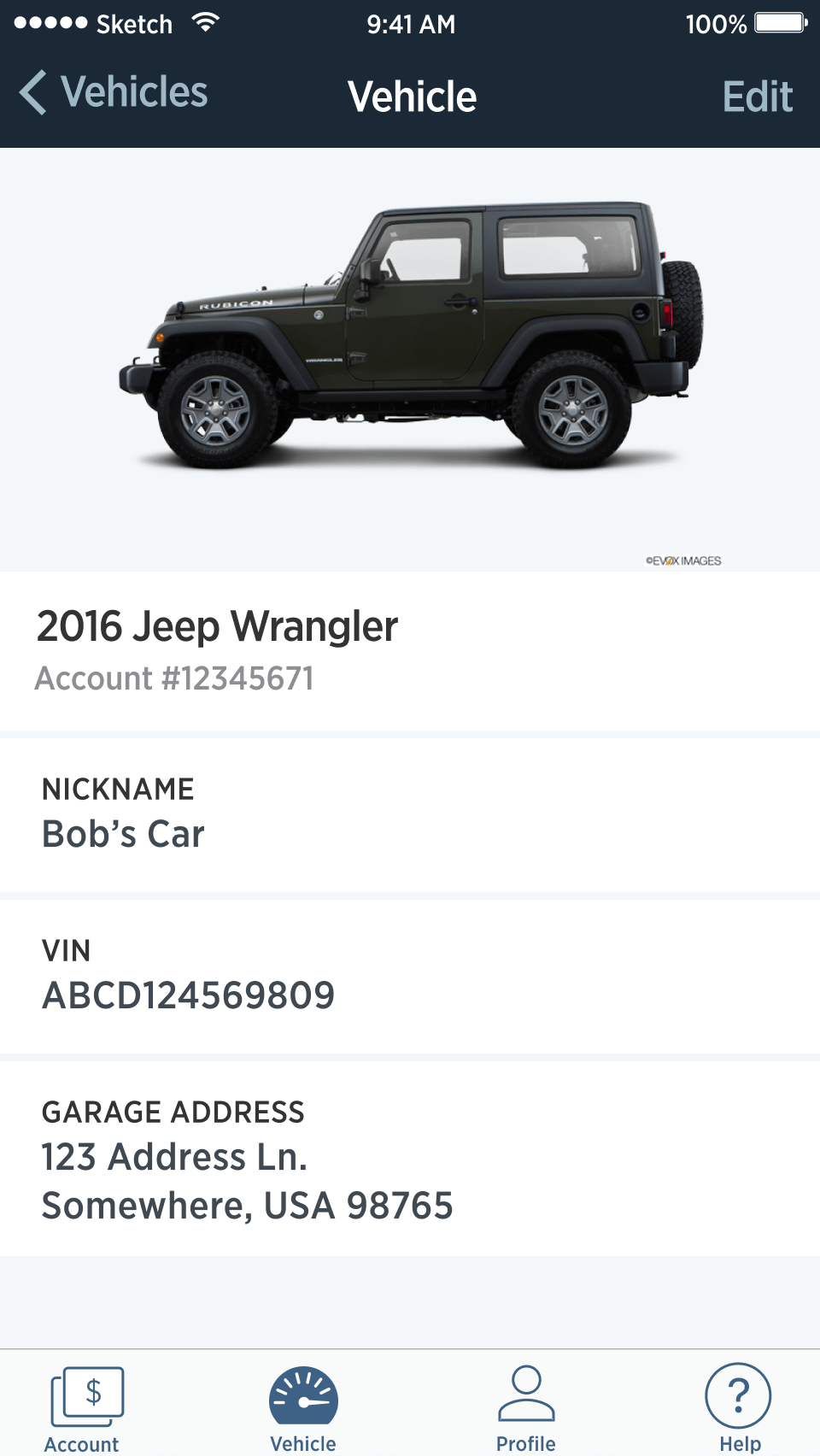
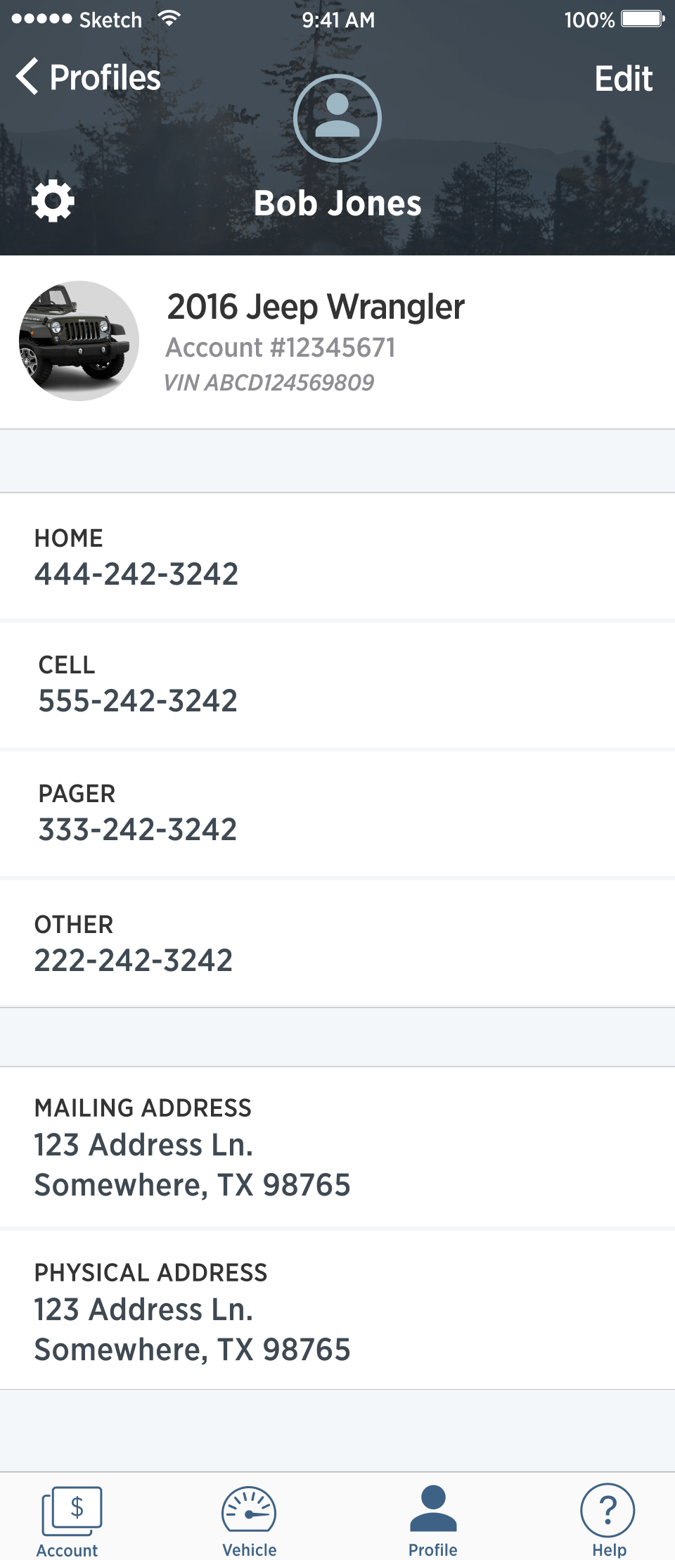
I wanted to connect the customer with the app experience in a more personal way and also promote our Chrysler partner's brand. The theme I wove throughout the design was the vehicle ownership aspect of their relationship with us. After all, the reason they were paying us every month was the car they were driving as they lived their life.

Dev work
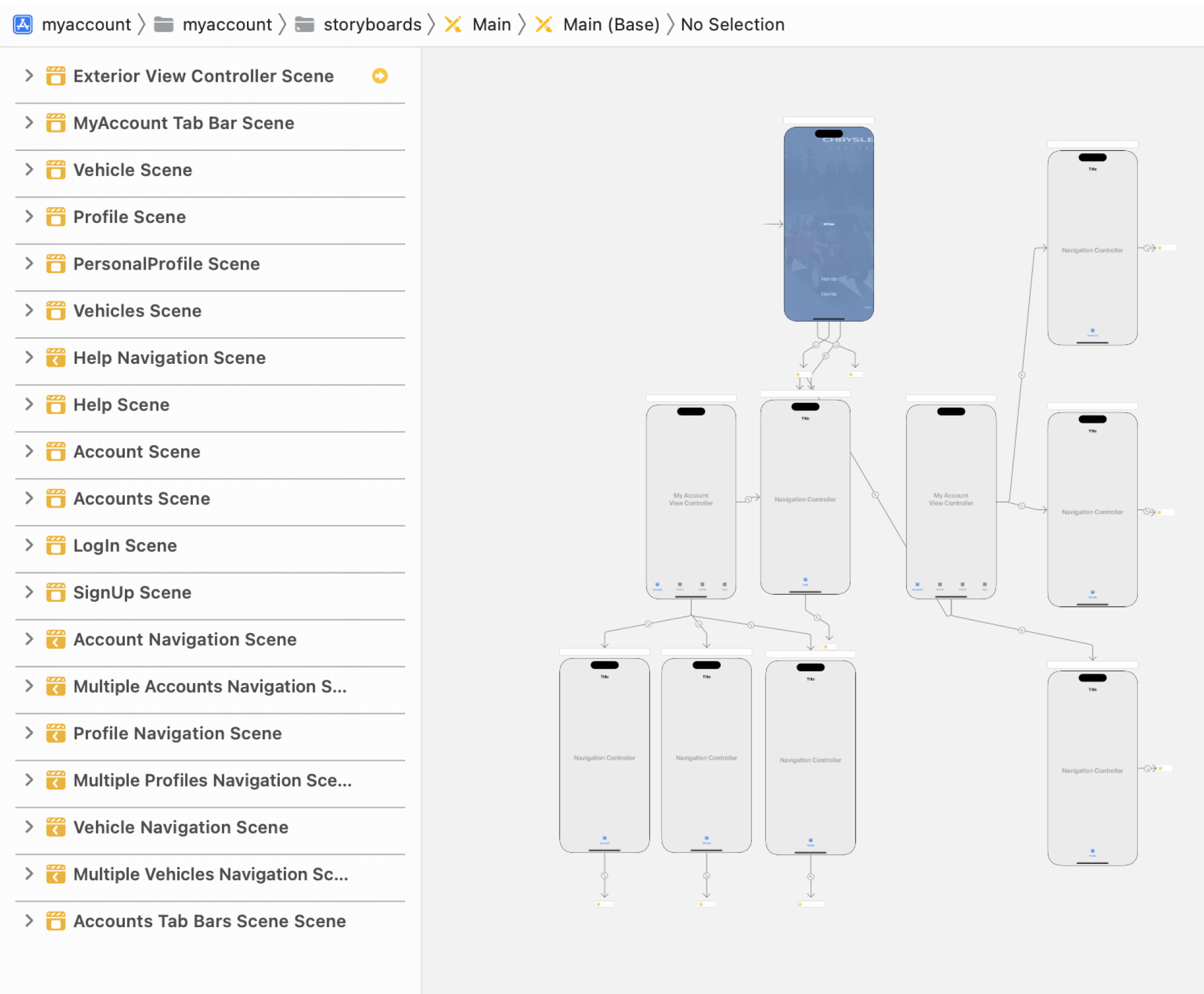
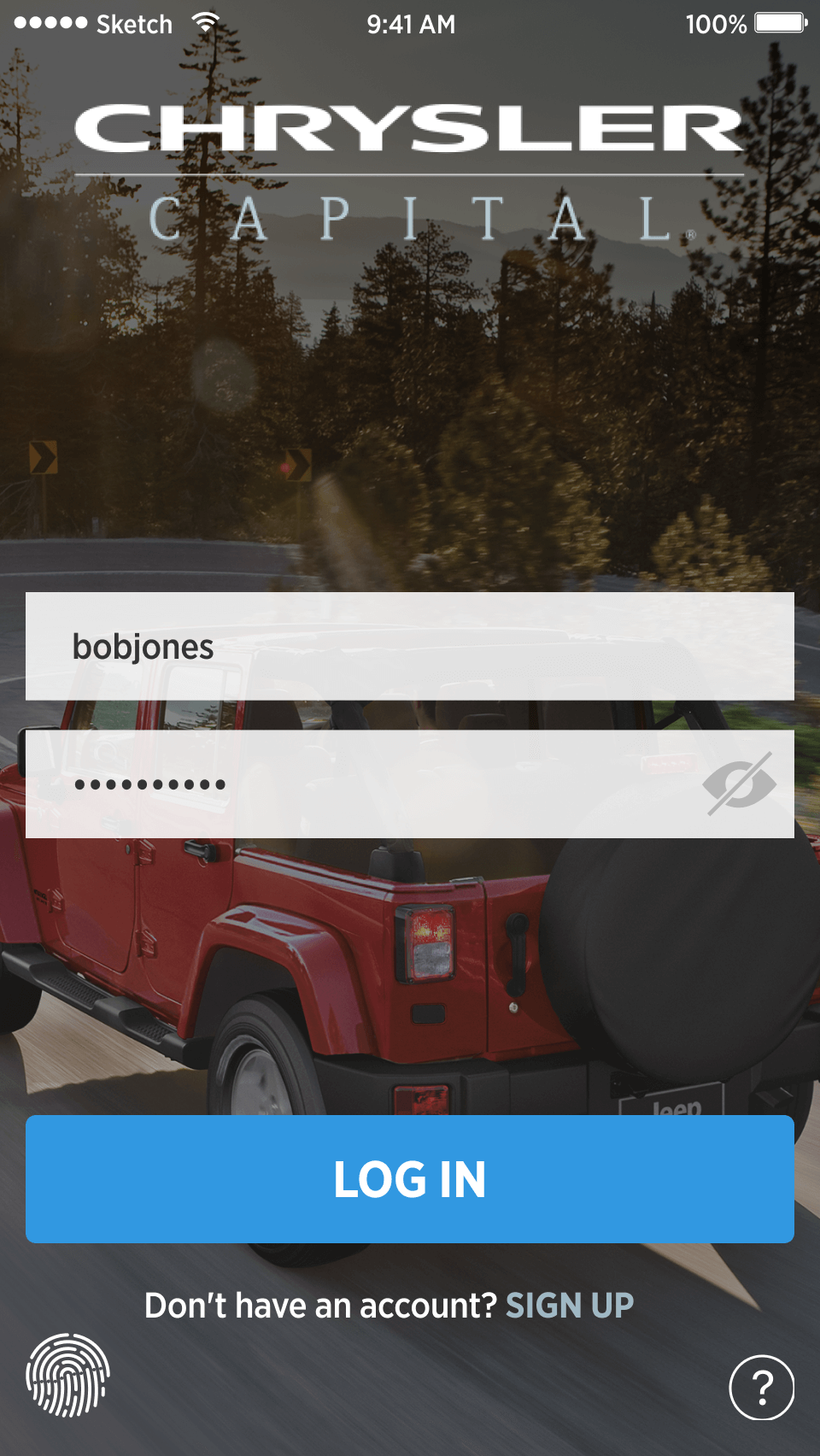
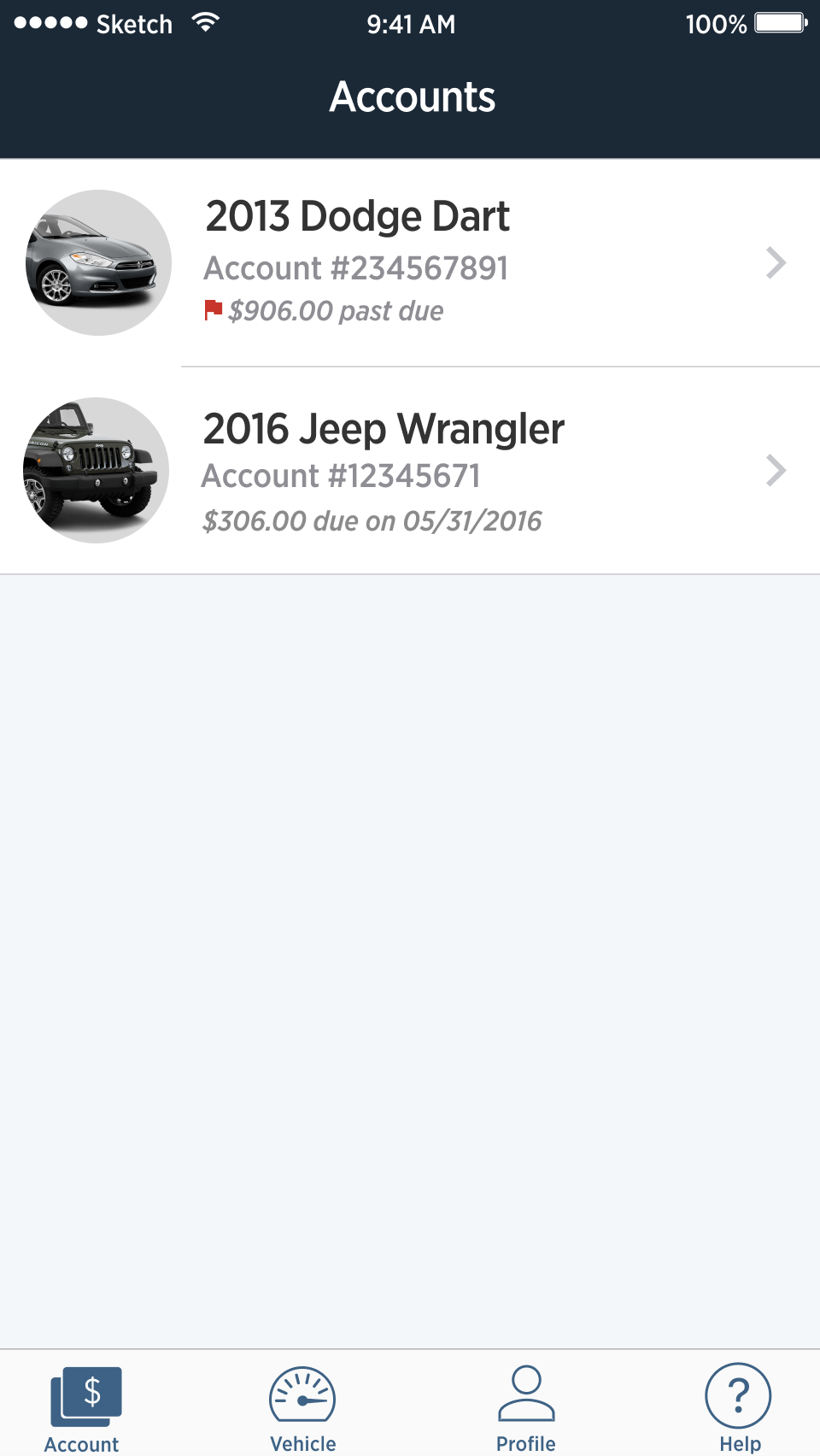
The finished app
(a few examples of the final screens)
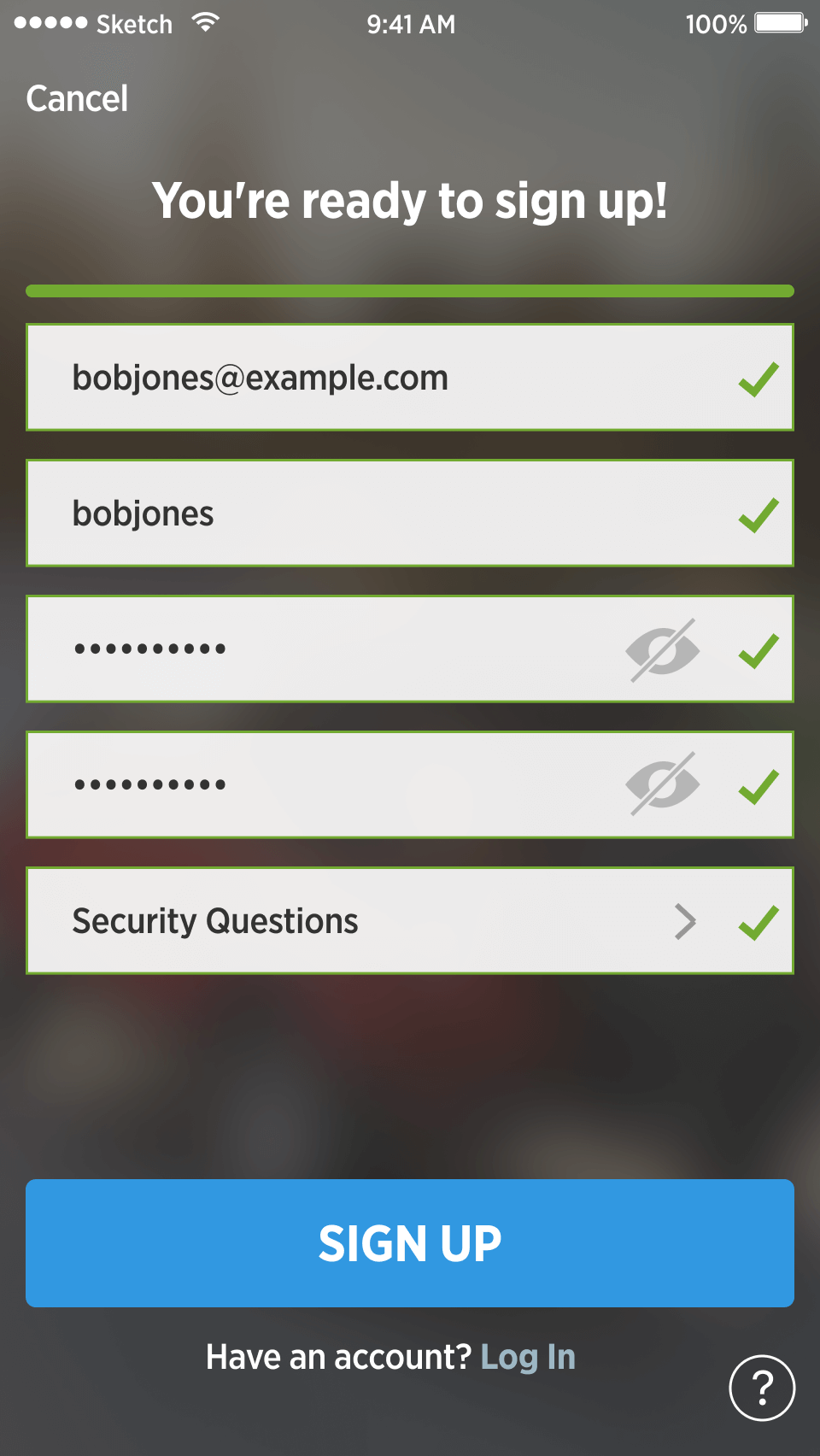
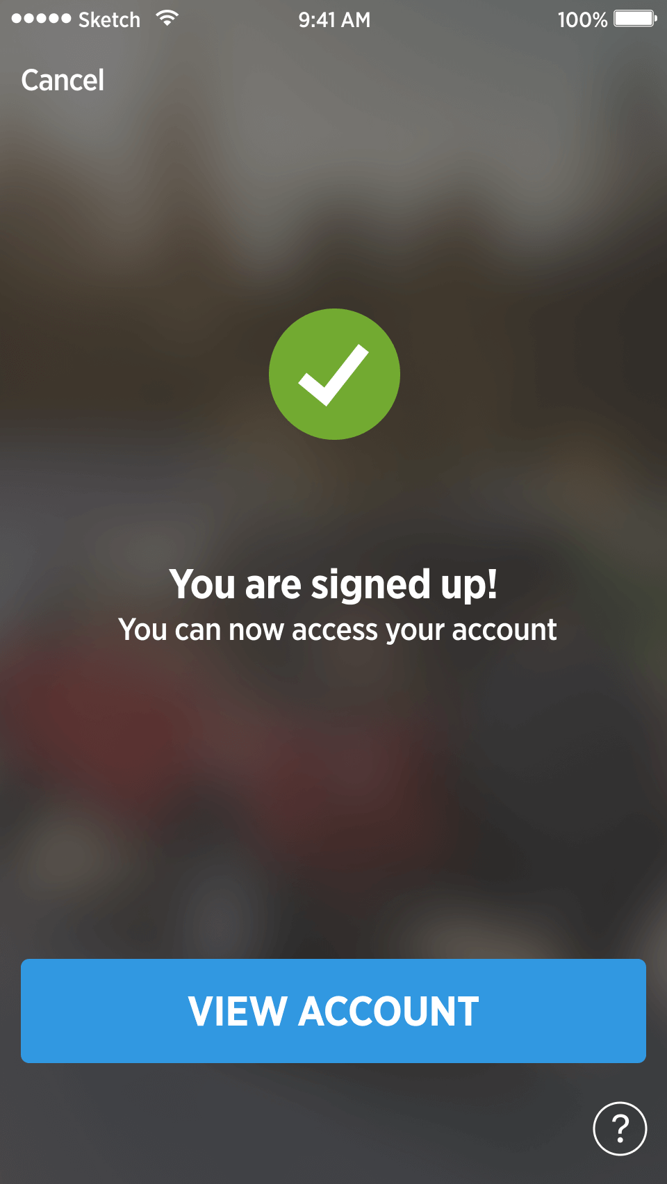
Sign-up demo of beta app
It was exhausting, difficult, and near impossible, but we ended the year with a quality, usable beta app that we could test. All that was left was a couple months of fine-tuning the payment experience and preparing the app for release, which we planned to finish at the start of the new year.
After the holidays, we returned to finish.
We delivered, but...
There was a problem.
We were told that the project must be put on hold because IT was being restructured.
Our IT developers were taken off of the project.
And our beautiful, working app was shelved — indefinitly .
My team continued supporting our marketing and internal mobile apps for the rest of the year, but the MyAccount mobile app was never resurrected. Eventually, in 2018, my specialized mobile team was disbanded and native mobile apps were moved to the digital design team where I also took over as Director of Digital Design (see my resume for more context).